Mentor Tribute

The Intuit Career Development team invited me to share a story for the launch of an internal mentoring website. Enjoy!

It’s 6:15pm on a Wednesday. 

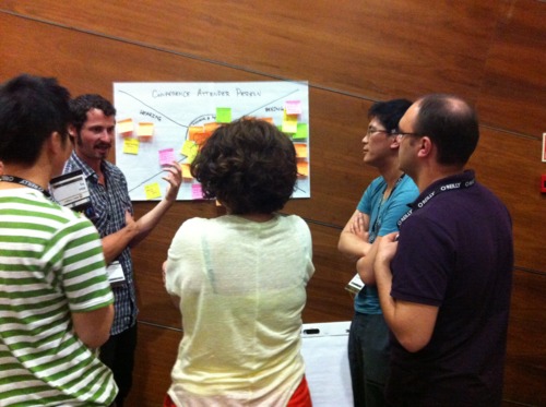
She walks by my desk, looking tired and stressed. “Got some time to look at that project?”

“Sure,” I reply, grabbing my notebook as we walk to a team room.

“Sorry I’m so distracted,” she confides as the door closes. “I’m on 4 projects right now and new ones keep coming up. I’m kind of losing my mind." 

On a typical day, I’d feel guilty about not being able to help. But today, I find myself thinking, what would Stephen do?

Stephen Gay has been my mentor for the last five months thanks to the Intuit Loop Mentoring Program. Loop pairs XD mentors and mentees to "support the development and retention of great people, foster the design community, and cultivate a lasting competitive edge through mutually beneficial mentor/mentee relationships that are trusting, open and aspirational.” I’ve participated in the program as a mentee three times since joining Intuit, and I’ve found it to be incredibly helpful. In addition to meeting wonderful people, I’ve learned a lot about corporate culture, communication, design, and myself.

At this moment, I’m realizing that one of the things I haven’t learned is how my mentors work their special magic. If Stephen were here right now, what would he say?

I think back to the last time I told Stephen about a problem I was having at work. He didn’t just offer sympathy– he asked lots of thoughtful questions and reflected back what he’s hearing. This helped me to see the problem in a new light, and approach it in a more rational manner. After we identified the problem, he helped me own the solution, rather than just telling me what to do. We brainstormed some possible approaches, and he helped me gauge which was the most appropriate for my situation. By encouraging me to own both the problem and the solution, he gave me the confidence to deal with the problem successfully.

It feels a little uncomfortable, but I decide to give it a try: I start asking questions. As she describes her many projects, I jot them in my notebook. She finishes, and we both look at my notes.

She starts laughing. “Oh, wow. I didn’t really realize how crazy my life was!”

We walk through the notes together, grouping and circling related activities. Then we discuss where she’s been spending most of her time and energy, and how that’s different from her personal passions.

She observes, “Maybe it’s not just about having lots of projects. I need to think about this a little more.”

I tear the page out of my notebook and hand it to her as we walk back to our desks. I feel a little disappointed that I couldn’t make her problems disappear, but I assure her that I’m available if she’d like to continue the discussion.

It’s 9:30am on a Monday.

She walks by my desk, a big smile on her face. “Just wanted to let you know I showed those notes to my manager. The conversation went really well and we came up with a few changes we’re going to make!”

I smile back and make a mental note to pass her thanks on to Stephen.

-

Many thanks to Stephen and all of the other wonderful mentors in my life.

Design for Delight is grounded in deep customer empathy, going broad with ideas then narrowing with possible solutions and finally, rapid experimentation with customers.


These principles were integral in a product we recently launched called Snap Payroll, a free, mobile application that allows small businesses on the go to calculate paychecks in minutes and determine how much to set aside for taxes.

— Intuit CEO Brad Smith in Forbes talking about Snap Payroll

Gamestorming

Notes from UXLX Gamestorming workshop taught by Dave Gray

image

Gamestorming is about keeping energy levels up during meetings to get great results. Can be used with teams, clients, users (participatory design), and more. See related book and iPhone app.

The workshop was a mix of theory and interactive examples that taught us several Gamestorming methods in a hands-on way.

Icebreaker: introducing ourselves by making our “trading cards”

image

image

Improv: Get into partners. Partner 1 describes her dream house. As she describes each detail, Partner 2 says “yes but…” to everything Partner 1 said. After 5 minutes, Partner 2 now has to say “yes and…” to everything Partner 1 says.

Notice the difference? Need to help people get to the “yes and…” and listen before judging. You dont need to necessarily agree. You just need to understand where the other person is coming from

Elements of gamestorming:

image

  • Sparks: exciting things that get people going. Ex: asking "what is a project that you’re really excited about right now?“ can ignite the initial energy of the team
  • Boards: the space. Can think of the room as a game board, where people are pieces in the game. 90% of things you can do to make a meeting better is stuff you can do before (prep right materials, right room). You’re setting the space and stage in which things happen
  • Pieces: The things that are moved around (ex: post its) These help people focus on the important things because they no longer have to hold everything in their head. Consider: chess masters can play chess without a board because they can hold everything in their head, but most people can’t. So provide the board and the pieces!
  • Time: Think about what is going on. People will get involved but unless you can keep things moving you might not get everything out that you want
  • Choices: Decisions need to be made, so you need to facilitate decision making
  • Chance: Creating serendipity and random chance can help people to get to know each other (ex: trading card game, world cafe game)
  • Making: creating, sketching, drawing, ideas

image

Everyone can draw!

People are more engaged and have better ideas when they’re drawing themselves.

Can educate people how to draw using the "visual alphabet” - 12 simple symbols that you can use to draw anything. It’s not about teaching people to draw. It’s about giving them permission to draw!

image

image

Visual Frameworks

image

image

Visioning Exercise

image

Rhythm

image

Empathy Map Exercise

image

image

6-8-5 Brainstorming

image

More techniques to try:

image

image

image

image

image

image

image

You can learn more about Gamestorming on the Gamestorming website.

Eric Ries: Catalyzing Lean Startup at Intuit

Eric Ries paid another visit to Intuit to inspire and coach our teams about Lean Startup. Here are some quotes & notes from the session.

(And here’s the summary from Eric’s first talk at Intuit)

On whether Lean methodology is “proven”:

People ask me “Do you know if lean startup works?” I have to say “Of course not!”

On the difficulty of adopting the mindset and behaviors of rapid experimentation: 

The first time I was up here and asked a team to go faster everyone laughed. It’s not supposed to be funny.

On getting Lean Startup into a company’s culture, and how it has to come from the top:

CEOs ask me how do I get more innovative people. I say buddy, look in the mirror.

The discussion turned to the challenges we face when trying to adopt Lean Startup in a large software company.

We discussed the importance of metrics. That it’s not about working on what you want to do in the product… it’s about working on whatever will improve your metrics.

On the importance of a clear vision: “If you don’t care you can’t learn because you don’t care.” It’s not enough just to see the anomaly. You need to care enough to explore why the anomaly is happening. And just think:

If we killed all the projects no one cared about we would solve all our staffing problems.

On the subject of cross-functional collaboration and Lean UX:

Tips for coaching others about Lean and catalyzing a rapid experimentation mindset:

Collaborating to Improve Performance

A colleague recently asked me: “Can we influence coding decisions or technology investments with some amount of UX prioritization around performance?”

It’s a great question for UX designers because yes, performance can make or break a delightful customer experience. Here’s how our team built an app with great performance:

Our team sees the user experience as a shared responsibility. Of course, this includes having great performance.

When our team was first starting out, the UX team had a seat at the table to ensure that we chose a platform that would allow us to create a great user experience. Performance was absolutely part of that discussion and that’s continued as we’ve made other tech decisions.

We work very collaboratively. I review my designs with my other teammates frequently, often multiple times a day. The engineers have all sorts of questions about the save model, when things are cached, desired behavior when the app crashes, what to display while information is loading, etc. Then we’ll brainstorm and decide upon the right approach for a given situation, and I’ll document the decision for future reference.

I also make myself highly available to the engineers as they implement the UI. I’m often answering emails and chat messages to clarify things, such as what should happen in an unanticipated edge case. Or I’m sitting next to an engineer and we’re trying out a few different animation options to see what feels right on a device.

I’m a big believer in this type of collaboration: I find that it takes me much less time to create a spec that helps the engineers build out what I’m envisioning. On the engineering side, we have far fewer UX bugs which means we can spend more time charging ahead.

Having a highly collaborative team also allows us to solve problems more effectively. When it comes to creating better app performance, here are just a few of our design/engineering approaches:

  • Interaction workflow tweaks
  • Adding “loading” screens
  • Changing how we export assets
  • Changing save/cache state
  • Loading things in the background before they are needed
  • Moving user to a new screen and loading in info piece by piece
  • Various back-end improvements

And why stop at improving app performance?

Collaboration is our greatest tool for crafting delightful user experiences.

Five Lessons for Creating Great Tablet Experiences (part 2)

Continued from Part 1 of my notes from a BayCHI talk given by Brennan Browne, a UX researcher at AnswerLabBrennan presented the pros/cons of different techniques used for capturing mobile phone/tablet user research sessions.

Screen Captures (video recording straight off of the device)

Pros: best image quality, portable, cheap

Cons: doesn’t work well with all devices (earlier iPhones can’t use this without jail breaking), doesn’t capture physical interactions w/ device, passwords/sensitive info can’t be hidden

Video (filming the screen)

Tips: 

  • equipment is expensive so consider demos or rentals
  • define a hotzone to the user (ex: put a piece of paper down on the table and ask user to keep the device over it)
  • be aware of room lighting/glare

A. Videographer

Pros: works for any mobile device, can capture physical interactions, flexible and portable

Cons: cost (need to bring an extra person to the session), screen may be difficult to see, may have to ask user to move around, lighting

B. Sled - camera structure that attaches to the device (ex: Noldus)

Pros: fixed, hi-res screen, captures physical interactions, no videographer required, very portable

Cons: won’t work with all devices, limits users ability to switch orientations or use slide out key boards, adds weight to the device, hard for participants to hide passwords or sensitive info

C. Document Camera - looks much like an old overhead projector

Pros: can capture device at any orientation, captures physical interactions, high res camera, no videographer needed, camera itself reminds users where to hold the device, can easily enter passwords/sensitive info by removing device from the recording area

Cons: price (>$7K), screen quality isn’t as good as a screen cap, not well suited for field studies

On a personal note, we’ve tried several of these methods in our iPhone usability studies and I very much prefer Screen Cap over Video. When we used a Noldus camera, we found that users were very hesitant to pick up with the device and interact as they normally would in real life. Instead they’d put the device down on the table and poke at it from afar. When we started running tests using Screen Cap (thanks to iPhone 4S/iPad 2 mirroring), we found that users felt more free to bring the device closer to their face, use gestures outside of “tap”, and rotate into landscape mode. Although we aren’t able to capture the user’s gestures on film, we take notes about interesting/surprising gestures to augment our notes.

Five Lessons for Creating Great Tablet Experiences (part 1)

Part 1 of my notes from a BayCHI talk given by Brennan Browne, a UX researcher at AnswerLab.

Trend 1 - Trading computer time for tablet time

  • Why? It’s more fun, easy, convenient.
  • Computer: in the home office vs. Tablet: comes everywhere
  • Tablets are portable, not necessarily mobile - possibly because need wifi (not all are 3G enabled)
  • Over past 6 months, see trend of more people using tablet at work - more employers are handing them out, there are more biz-related apps available
  • People are afraid of taking iPad outside of home, Starbucks, work, or other places where they feel safe (i.e. not public transit) because they fear theft
  • Choice of device to use isn’t based on where user is– it’s about what user wants to do. 
  • Phone: quickly checking something
  • Tablet: immersive - plan to sit down with for a longer period of time
  • Computer: for tasks that require more management/multitasking/typing
  • People prefer typing on everything (i.e. phone, computer) except a tablet
  • Did see people using bluetooth keyboards primarily if they’re trying to replace their computer with an iPad (although would still often have to turn back to a computer for other reasons)
  • Whichever device is most convenient at the time will often be the one they choose to use. For example, they might pull their phone out of their pocket while on the couch, rather than getting up to grab a computer from another room.

Trend 2: The tablet and shared experiences

  • Tablet is commonly shared amongst family members
  • In the past 3 months more common to have multiple iPads within a house– “I got tired to sharing it so I got everyone in my house one”– much like what happened when computers were growing in popularity
  • Shared nature can lead to some problems because no built in multiuser support in iPad & very limited in Android. Puts the responsibility for multi-account support on the app developer
  • Facebook tries to support this (to view this, sign out of the FB iPad app and see ability to create other accounts)

Trend 3: Apps vs Web

  • Many users are content to use the web on iPad - they expect to be able to access the full version of the website and to have the same level of functionality that they would have from the computer
  • Example of a bad app: Target (users felt they were being forced to leave the app to view product details on the website which broke their experience - “what’s the point of even using the app?”)
  • Example of a good app: Zappos (users get full functionality of the website, plus ability to interact with pictures, better shopping cart experience, etc.)
  • Best Practice: give lightweight help to users during their first use experience, then make help content available (but not in their face) going forward
  • Best Practice: use universal app instead of having a separate iPhone/iPad app if possible or users might not realize that you have a different version of the app in the App Store
  • Best Practice: website interrupts that alert you that an app is available is fine unless it impedes the web experience (ex: people were frustrated by Yelp which asks them to download the app each time they visit the website). Using a banner or sending an email may be even more preferable.
  • People generally update their apps within a month
  • See lots of people syncing their iPads to computer, but it’s not as common as syncing their smartphone
  • Did observe some users saving websites to their home screens, but these were generally more tech-savvy users or those who didn’t care for apps
  • Saw a mix of people who did/didn’t want push notifications. Best Practice: don’t ask users whether they want to accept push notifications until they’ve spent some time within the app and have an idea of how/why notifications might be useful to them

Overall Design Recommendations

1. Design for a “small laptop”, not a “big phone”

  • Create fast, intuitive, full featured experiences that are fun to use and better than the web

2. Full web

  • People expect a full website when browsing on the iPad browser, so ensure your site is optimized to deliver a great experience. 
  • Ex: use HTML5 to customize the keyboard when typing in a datafield

3. Content over context

  • Location-specific experiences that are king on smartphones may not be as important on tablets because they aren’t necessarily being brought everywhere
  • Instead, focus on rich content and superb UI (especially taking advantage of video & photo)

4. Shared device

  • Consider social nature of the device when design log in components, how data is stored, and anything involving transactions/ecommerce
  • Ex: Amazon app allows users to view recommendations/watch list without signing in, but user is prompted for password when making a purchase

5. Security fears

  • People have no clue about security on a tablet. In all of their testing, they’ve never seen someone who’s set up a passcode on the iPad. The people who are the most tech savvy are the least afraid of security risks… but non-savvy users are more afraid about persistent log in and entering credit card info and will sometimes go back to a computer when they’re required to input credit card credentials
  • Tip: reassure users that the privacy/security of your app/website on the iPad are the same as what they’ll find on the computer

In part 2 of this post, I’ll summarize Brennan’s recommendations regarding smartphone/tablet usability testing.

Eric Ries: Lean Startup + Big Biz

Notes from Eric Ries’ talk about applying Lean Startup to a large software company at the Intuit Delight Forum.

“There are 3 acts to every story, and entrepreneurship is mostly in phase 2, the boring part” – Eric Ries

Entrepreneurs are everywhere

  • They aren’t just “the guy eating ramen in the garage”
  • Definition of a startup: “A human institution designed to create something new under conditions of extreme uncertainty”
  • Nothing to do with size of company, sector of economy, or industry; it’s about running experiments

Uncertainty 

  • If you’re building something new you are naturally in extreme uncertainty because you don’t know the users or behavior
  • Since nowadays we can build everything, the question isn’t “can it be built” but “should it be built”
  • Today lots of companies waste people’s time– no one takes ownership for it
  • Who’s to blame? Fred Taylor, the father of “Scientific management” - study work, find the best way, manage by exception, standardize work into tasks, compensate based on performance, “the system will be first”
  • What we need is “Entrepreneurial management”, where we can pivot (change direction but stay grounded in what we’ve learned)

Speed wins

  • If we can reduce the time between pivots, we can increase odds if success before we run out of money
  • Minimize total time through the loop - ideas, build, code, measure, data, learn - by avoiding “achieving failure” (successfully executing on a bad plan)

Innovation Accounting - 3 Learning Milestones

  • Establish the baseline -  build a MVP and measure how customers behave right now
  • Tune the engine - experiment to see if we can improve metrics from the baseline towards the ideal
  • Pivot or persevere - when experiments reach diminishing returns, it’s time to pivot

Coaching

Eric held a “live coaching” session in which he provided feedback and advice for teams regarding real projects that they were working on. Top takeaways:

  • Don’t worry about the competition and what they know about you. It’s all about you moving faster than the competition.
  • Regarding competitors stealing ideas that you’re just testing: “Try to get someone else at another company to steal one of your ideas and notice that it’s really hard to do that” - observed that many competing companies have similar backlogs of features but it can be equally hard for both to actually get them into a product. In the end, it’s all about how gets there first.
  • Worried about potentially damaging your company’s brand? Try releasing under a different brand name.
  • You can test different types of application positioning by using different words or images on your marketing pages.
  • Regarding sustainable growth: New customers come from the actions of past customers. Engines of growth: Paid, Viral, and Stickiness/Engagement. Growth needs to be engineered, so choose one to focus on and do everything you can to help drive that up. Can use “lifetime value” as a framework for thinking through this
  • Consider the distribution channel you will use to get to your customers
  • Get into a rhythm/cycle where every 6 weeks, you meet to decide whether you’re on track or need to pivot. Have a clear understanding of the evidence you’ll need at that meeting to make that decision.
  • Remember: pivot is changing the strategy without changing the vision

Wrap up

Myth: Lean means “cheap and saving money”
Truth: It’s not about cost, it’s about speed

Myth: Companies are “lean” if they are small bootstrapped startups
Truth: Companies are “lean” if they are ambitious and are able to deploy resources in a good way

Myth: Lean startups replace vision with data or customer feedback
Truth: They are driven by a compelling vision, and are rigorous about testing each element of this vision.“ You don’t turn on your GPS and ask it where you should go. Data helps you get there, it doesn’t tell you where you should go.”

Q&A

A few final thoughts from Eric that emerged during the Q&A section.

A message to big companies: “There are startups gunning for you right now. It’s not like size is everything.” At big companies, people know what needs to be done but are afraid to do it. Hopefully this is an invitation for people to actually do this.

Regarding whether Lean methods of testing represent loss of integrity: Integrity means being clear and honest with the customer and apologizing when you do something wrong. “We are already doing the wrong thing. Our customers dont know how to use our products, so our customers are constantly experiencing us as a bait and switch.”

Early adopters would rather have things in an unfinished state and being the first to try it. If you are spending too long perfecting it, customers will get mad because they can’t use it yet.

Regarding legacy code: Being first means that people will be gunning at you, but whoever moves faster will win. Legacy code means that everything we’ve learned is embedded in the code. If you have a choice, invest in new features, in cleanup, or in things that help you move faster in general. Refactoring tools can help you to move more quickly so they’re a good investment. But if you pivot because your use cases change, refactoring is better than starting over.

Teams need good measuring tools. "Metrics are people too.“ Best method is usually a homegrown way to see important data for a product, such as 5 key metrics pulled straight from the master database.

"Most visions can’t be recognized. As a startup, think that you’re the exception and systematically try every idea about getting there.”

Regarding selling through channels: Ask “am I creating value for the end user? What is lifetime value of the customer?" It might make sense to use the channel, but for testing you might first want to try selling direct and learn, then start applying that learning when you get building with the channels.

Native vs. Mobile Web, 1 year later

Remember how a year ago everyone was asking “Native or Mobile Web Apps*”? At the time, the pros/cons list looked kind of like this:

Native App: allows device specific strengths (GPS, camera, notifications, etc.) but you have to build a separate app for each device & deal with app store overhead

Mobile Web App: can build one thing that will work across many platforms and you don’t have to deal with app stores, but you lose some device-specific capabilities and there was no clear winner w/ dev frameworks

Since then, the debate has shifted. It’s now generally accepted that when it comes to building apps, native wins.

Here’s what’s changed:

  • The top mobile players have emerged: as people retire their feature phones, they’re upgrading to iPhone, Android, and Windows smartphones. This helps app developers to make safe bets on where to invest their resources, rather than anxiously trying to guess what’s coming next.
  • The “big 3” (Apple, Google, Microsoft) are training users to choose native apps. They all have a clear incentive to do so: when a user downloads an app, guess who makes a cut of the profits?
  • Native apps are widely recognized by users as creating a better user experience:
  • 1. UI elements fit with user’s expectations for the device (I’ve heard many Android users complain about Android apps that look like they were designed for iPhone. Non-tailored experience in mobile web are just as off-putting)

    2. They feel “faster”: native allows you to minimize delays caused by having to download images/content

    3. When users lose internet connection, they can continue with their native app experience in many cases

  • I also loved this point from the good folks at N/Ng:
  • Finally, let’s consider the differences between Nielsen’s Law for Internet bandwidth and Moore’s Law for computer power. Over the next decade, Internet bandwidth will likely become 57 times faster, while computers will become 100 times more powerful

    In other words, the relative advantage of running native code instead of downloading stuff over the Internet will be twice as big in 10 years. One more point in favor of mobile apps.

No one knows what the next 12 months will bring. But for the here and now, “native” wins.

*Throughout this article I am referring to apps, not mobile-optimized websites. It always makes sense to mobile-optimize your website!

The difference between user interface design and hardware specs is that better usability is derived from one-time expenses for user studies, design iterations, and coding — whereas beefier hardware (say, adding a camera) is a repeated expense for each additional unit manufactured.


This means that even cheap devices can have great usability because the cost of better research and design is amortized across millions of devices. This is why usability has stupendously high ROI for any big project.

— Jakob Nielsen’s Alertbox, “Rebuttal to Critics of Kindle Fire Usability Study”

Designing a UI for 6 Billion People

Notes from a BayCHI talk given by Larry Tesler, the father of the “cut and paste” interaction.

Challenges in designing “cut and paste”:

  1. Unfamiliar metaphor - unfamiliar to anyone not in the copy industry, and for those in the industry the definition was different
  2. User mistakes - they observed that users would make mistakes, such as accidentally leave things in the buffer
  3. Extensibility to other applications - how would it apply to non-text programs such as drawing applications?

Although it wasn’t perfect, they continued to push for it and consider new ways to extend it. They even spent a lot of time dreaming up future possible applications to think about how they might use it later.

Since the first time he thought of cut and paste, it took him 7 years to roll it out.

Other UI paradigms that require exploration and definition: gestures, speech. We’re just at the beginning.

Reflection on Apple: They got so good at understanding their users that the culture moved away from user testing. That’s why some gestures on iOS aren’t necessarily intuitive today– user research is no longer as big a part of their DNA.

Life Learnings

  • Build bug-free, easy to use software
  • Don’t focus on being compatible with a bad UI 
  • Never confuse “busy” with “productive”
  • You don’t have all the answers, so team up
  • If everyone thinks that something is impossible, it’s a great topic for research
  • To fight an uphill battle choose a short hill 

And how do you resonate with your customers at an emotional level without excessive human interaction? You design it in. If you create a positive relationship between the product and the end user, you don’t have the expense of someone needing to explain, “Here’s why this is important, this is how you use it, and this is why it matters to you.”
— Bruner & Emery, “Do you matter?”

We now favor flexibility over high fidelity (that is, MP3s over CDs), convenience over features, quick and dirty over slow and polished. Having it here and now is more important than having it perfect. These changes run so deep and wide, they’re actually altering what we mean when we describe a product as “high-quality.”
— Luke Williams, “Four Ways To Spot Markets Ripe For Disruption”

The problem with mobile app "Pretenders"

So true:

The iPhone browser already has a back button

This is a great explanation of why mobile web apps shouldn’t simply try to emulate a native app:

Users of pretender apps get an experience that falls squarely in the uncanny valley — it looks like a native app, but something isn’t quite right. Perhaps it doesn’t respond as expected or it doesn’t quite follow the conventions of a native app. Often pretender apps have both of these problems and then some. They simply don’t feel “at home”.

Another problem which we’ve heard in usability: non-iPhone users are put-off when they encounter mobile websites that “look too much like an iPhone”. There are interaction problems: should the Android user tap the glossy button or the hard back button to move to the previous page? There are also visual design problems: when a page screams “designed for iPhone,” non-iPhone users feel like they’re being treated as second-class citizens. Not good, considering that many users consider their choice of phone to be a mode of self-expression.

Recommendation: Focus less on “I’ve fooled them all into thinking this is native!” and more on “This is a great user experience.” A few tips:

  • Keep it clean & quick to load (consider your use of images, animations, etc.)
  • Streamline key workflows: keep in mind that each time the user navigates to another page, they run the risk of encountering slow load times
  • Optimize layout & visual elements to be appropriate for a small screen size (look to native apps for best practices about font size, line height, tap area, etc.)
  • By default redirect users to the mobile-optimized version of your site, but include a link to the full version of the website

…we don’t live in an age of information overload, but of “filter failure.”


As we roll our own filters based on new authorities and new friends and Circles, so there becomes less overlap in our general tastes… At the same time, our splintered filters will result in a self-selecting bias.


We naturally gravitate towards filters that echo our point of view and taste. In public affairs, this leads to a polarization of the polity. More darkly, as JP writes, “There is a growing risk that you will only be presented with information that someone else thinks is what you want to see, read or hear. Accentuating your biases and prejudices. Increasing groupthink. Narrowing your frame of reference.”

http://gigaom.com/2011/07/23/the-democratization-of-communication-in-filter-we-trust