“And how do you resonate with your customers at an emotional level without excessive human interaction? You design it in. If you create a positive relationship between the product and the end user, you don’t have the expense of someone needing to explain, “Here’s why this is important, this is how you use it, and this is why it matters to you.””
iOS5 Fonts
Visual list of fonts that come with iPad & iPhone iOS5.
“We don’t realize how quickly we will adapt to a pleasurable event and make it the backdrop of our lives. When any event occurs to us, we make it ordinary. And through becoming ordinary, we lose our pleasure.”
“We now favor flexibility over high fidelity (that is, MP3s over CDs), convenience over features, quick and dirty over slow and polished. Having it here and now is more important than having it perfect. These changes run so deep and wide, they’re actually altering what we mean when we describe a product as “high-quality.””
The problem with mobile app "Pretenders"
So true:

This is a great explanation of why mobile web apps shouldn’t simply try to emulate a native app:
Users of pretender apps get an experience that falls squarely in the uncanny valley — it looks like a native app, but something isn’t quite right. Perhaps it doesn’t respond as expected or it doesn’t quite follow the conventions of a native app. Often pretender apps have both of these problems and then some. They simply don’t feel “at home”.
Another problem which we’ve heard in usability: non-iPhone users are put-off when they encounter mobile websites that “look too much like an iPhone”. There are interaction problems: should the Android user tap the glossy button or the hard back button to move to the previous page? There are also visual design problems: when a page screams “designed for iPhone,” non-iPhone users feel like they’re being treated as second-class citizens. Not good, considering that many users consider their choice of phone to be a mode of self-expression.
Recommendation: Focus less on “I’ve fooled them all into thinking this is native!” and more on “This is a great user experience.” A few tips:
- Keep it clean & quick to load (consider your use of images, animations, etc.)
- Streamline key workflows: keep in mind that each time the user navigates to another page, they run the risk of encountering slow load times
- Optimize layout & visual elements to be appropriate for a small screen size (look to native apps for best practices about font size, line height, tap area, etc.)
- By default redirect users to the mobile-optimized version of your site, but include a link to the full version of the website
“…we don’t live in an age of information overload, but of “filter failure.”
As we roll our own filters based on new authorities and new friends and Circles, so there becomes less overlap in our general tastes… At the same time, our splintered filters will result in a self-selecting bias.
We naturally gravitate towards filters that echo our point of view and taste. In public affairs, this leads to a polarization of the polity. More darkly, as JP writes, “There is a growing risk that you will only be presented with information that someone else thinks is what you want to see, read or hear. Accentuating your biases and prejudices. Increasing groupthink. Narrowing your frame of reference.”
”
HTML5: Perks + Graceful Degradation
From Smashing Magazine, some of the lesser-known delights of HTML5:
- <a> is a block element
- placeholder text within forms (I’m very excited about this one!)
- improved method for defining page sections
My favorite update is that the W3C guidelines dedicates an entire section to compatibility and graceful degradation.
It’s time to celebrate the end of the myth of cross-browser consistency. Adaptive design used to be about designing for IE vs. Firefox and 800x600 vs. 1024x768. But that’s all changed with the new proliferation of devices such as mobile phones, tablets, high resolution monitors, dashboard displays, and web TV.
It’s not longer just the web developer’s challenge to make sure that everything looks exactly the same across all browsers and devices. The designer must work in tandem to ensure that the user experience adapts smoothly across the many devices through which we now live.
You're better at solving someone else's problems
Studies show that people solve problems more quickly & creatively when they think about them in the abstract. However, when faced with challenges in our proximity (space/time/social connections), people tend to think concretely. Thus when solving problems, it can be useful to take a step back and/or find others to problem-solve with you. More tips for creative collaboration in Daniel Pink’s article.
Sounds like yet another reason to continue working across business unit lines. Regular check-ins, discussions, and design reviews may help to move our projects forward more quickly & with higher quality.
By the way, there have been times when this technique has been quite helpful:
When partners aren’t an option, establish distance yourself. Create some psychological space between you and your project by imagining you’re doing it for someone else or contemplating what advice you’d give to another person in your predicament.
iPad vs "the other guys"
From AllThingsDigital, “consumers don’t want tablets, they want iPads”
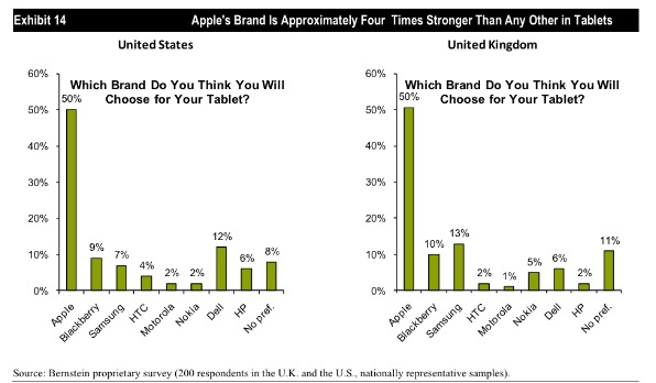
These statistics do not surprise me. Over the past few months, we’ve interviewed over 50 small business owners about how they use mobile devices in their work and personal lives. I’ve heard many of them say, “I want to get an iPad”, “I’m just about to buy an iPad”, or “I just got my iPad a few weeks ago”. I never heard anyone say, “I want to get a tablet”– they specifically called out the iPad.
Of the users that we spoke to, only 2 mentioned tablets other than the iPad, and they did not describe them favorably. One told us how he’d bought a Xoom for his wife but they both disliked it so much that he was planning to return it.
For some more thoughts on “iPad vs. everyone else”, check out Marco Arment’s highly relevant blog post: “There really isn’t much of a ‘tablet’ market”
iOS5 Video Demos
Video demos of iOS5 posted by Gizmodo:
Also check out the list of new features that Apple published on their own website. Can’t wait to test these out this Fall!
BayCHI: Turning Mediocre Products into Awesome Products (Zurb)
I recently attended a BayCHI talk entitled “Turning mediocre products into awesome products,” led by two members of interaction design consultancy Zurb.
Amidst screenshots, photos, and Star Wars references, Jonathan Smiley & Jeremy Britton told the story of how they designed & launched a new product in 4 months. My notes from the talk follow:
“Design for People”
Design Principles:
- Small details can change the world
- Craft matters (you need to be able to design and build it!)
- Everybody should be able to design - “Can’t draw stick figures? Pick up a yellow pen and highlight something. Can’t pick up a yellow pen? Pick up a red pen and cross something out”
- You need people
- Ask “why” five times
- We love businesses with a long-term view
- UX design doesn’t exist (as a discipline) since you can only control ½ of the experience; the other person brings their own context to the table
What do you need to make awesome products?
- Lots of enlightened trial & error
- Customer feedback ASAP
- Team behind it - buy-in, want it to succeed
After this talk, challenge yourself to:
- Design 1 more prototype
- Demo with 5 more real customers
- Create 1 more team advocate
The “lone genius” doesn’t exist - everyone’s heard fables of insight happening overnight, but we know that’s false & lots of work goes into every great invention
- ex: the lightbulb
- ex: Steve Jobs (has deep intuition for people, iterates, fails)
Building Verify
Week 1: Sketches
- multiples -> no ego bruise (don’t feel bad about ones that suck)
- fast -> in a flow (don’t need to set up anything beforehand)
- cheap -> easier to repeat
- disposable -> just a spark (easy to chuck bad stuff)
- opportunity -> “wow” moments (accidental moments of insight)
Sketching becomes the “requirements” doc - better than a huge doc because they look less intimidating so people respond to them more honestly & productively
Month 1: Prototype
- Front end code in ~1 week
- “Spec” - Created a single page that lists out every screen in the app in order to build the app, including thumbnails of what they screens will look like. Divided up by user task. Links directly to the pages.
- Literally scanned, chopped up, and dropped hand-sketched icons into the app
Month 2: Test Ideas & Iterate
- presented at “Demo 2010” conference, got lots of excitement & signups
- shared with users & iterated
Month 3: Private Release & Feedback
- beta with 200-300 users
- once people were using & paying for it, feedback came in strong
- continued to learn user behavior - when added links to more tests at the bottom of the “Thank You” page, they found users would usually take another test because they’d found the last one to be so quick & fun
Month 4: Launch!
Additional Reading Material
- Sketching User Experiences by Bill Buxton
- Designing for People by Henry Dreyfuss (early user-centered design based on human form & psychology)
UK iPad Usage Infographic
Cute & interesting infographic showing UK iPad usage stats including:
- Location used (yes 35% of users use it in the bathroom!)
- Who they share the device with (50% share with a spouse/partner)
- Other devices owned (57% have an iPhone, 51% have a Wii)
- Number of paid apps (33% have paid for 20-49 apps)
What's new in iOS 5
According to iEatApples.com,
Apple mentioned 10 major features out of the 200 features they’ve claimed to have added in this latest version of iOS5.
The site has compiled a list of 165 of those changes, and will continue to add new ones as they are found.
From what I’ve seen thus far, the features which will most impact our app design will be Reminders, Twitter integration, and possibly iCloud.
“But why is being lazy a good attribute for doing UX design? Because it prevents one from doing stupid, cute, things. Sure, some of those stupid/cute things might be brilliant, but most of them would diminish the UX of the product or perhaps take a lot of your development time for no real improvement to the final result.
Just like in evolution, there are lots of mutations but only a very few of them will actually be useful.
”
Plain Clip
I do a lot of copying-and-pasting between programs (copying things into/out of emails, moving stuff around Evernote, copying snippets off the web, updating Word files, etc.) and it’s always a headache to deal with formatting. Using the ol' copy - open TextEditor - specify plaintext - paste - select all - copy - paste method is frustratingly inefficient.
Thus I was absolutely delighted to find Plain Clip (Mac OSX only). This little app is so simple it has no UI, but it adds big value by stripping out formatting with just one click.
Here’s how:
2. Install to your Applications folder
3. Add a shortcut to the app in your Dock by dragging & dropping
4. Copy something with nasty formatting (Cmd-C), then click the app shortcut in your dock, then paste as usual into another file (Cmd-V)
Voila! Lovely plaintext, right where you want it.
Tips to Simplify Signups and Logins
Creative ideas for simplifying signup and login experiences. Geared towards web, but many could be used for mobile as well.
Customer Care in Mobile Apps
Some tips from Mashable about customer support in mobile apps:
- When building an app, acknowledge that some aspect of “traditional care” (support agents, phone help, help documents) may still be needed and plan for them
- Streamline the experience - app could be used to immediately transfer the users to the right agent or schedule a callback while giving the agent proper context
- Notifications can be useful for informing users about outages and other problems before they encounter them and have a bad experience
- Use the info that you know about users of the app (usage history, etc.) to tailor the support experience to them
- Take advantage of unique mobile capabilities (touch, voice input) to help users find what they need faster
The Noun Project
A free symbol library with the mission of “sharing, celebrating and enhancing the world’s visual language”. The images are simple, lovely, and clear.
Android Design Guidelines | Mutual Mobile
A set of unofficial Android Design Guidelines from the folks at Mutual Mobile. I found it to be a useful translation of the Android Developer design guidelines into “design speak”.
Useful recommendations include:
- Dimensions for common UI elements (such as tab bar) across devices
- When to customize or go with default UI components
- Things to watch out for when specifying rich visual design
- How to size & export button/icon assets
- Using draw9patch
- … and all sorts of other little hints & tricks for avoiding Android “design disasters”
Chart: How Many Users Does Twitter REALLY Have?
It seems that “175 million users” may be a bit of an exaggeration. This article estimates the number of active Twitter users to be closer to 56 million. Although the math is a bit shady, it’s interesting to see the thought process that they went through.
Bonus fun fact:
At Facebook, a company source tells us, they believe that a user is not going to end up sticking around unless they make friends with 10 people.